%20Kristin%20Ann%20Interior%20Design%20.png)
Collaboration of the 2024 Colors of the Year
- Kristin Bergunder

- Apr 11, 2024
- 2 min read
I have always said paint is powerful and can completely change how a space feels just with color. It is very intentionally used in marketing and company color selection to evoke a specific emotion. A deeper green is high on my list of color choices this year. I used Iron Ore with Sherwin multiple times with clients in the past year so number one on our list for announced color choices of the year selected by paint manufacturers is not a surprise.
BEHR PAINT
Cracked Pepper is neutral enough to adapt to any design style, from midcentury modern to rustic farmhouse. It also plays well with a variety of textures. Pair it with plush furniture and a soft shag rug for a cozy gathering space, or incorporate metallic accents and exposed architectural elements for an industrial aesthetic.

HGTV
Persimmon balances the energy of tangerine with grounded neutral undertones, making it perfect for spaces like living rooms and kitchens as it promotes positive relationships and conversation. It brings lightness and energy to the gathering spaces of your home. It's bright without being overwhelming, thanks to neutral, pastel-like undertones that provide a warm, welcoming feel.

BENJAMIN MOORE
Blue Nova by Benjamin Moore is a rich, grounded blue that works just as well on an accent piece as it does covering a color-drenched room. The color was chosen to represent the blend of modern and traditional styles that are popular in home interiors right now. It is an alluring mid-tone that balances depth and intrigue with classic appeal.

SHERWIN WILLIAMS
Upward is a bright and breezy blue that was designed to infuse peacefulness into any space. It brings to life that carefree, sunny day energy that elicits a notion of contentment and peace. With this color, take a pause and infuse a new sense of ease. One that doesn't overwhelm, but rather establishes meditation and tranquility.

PPG - PORTER PAINT
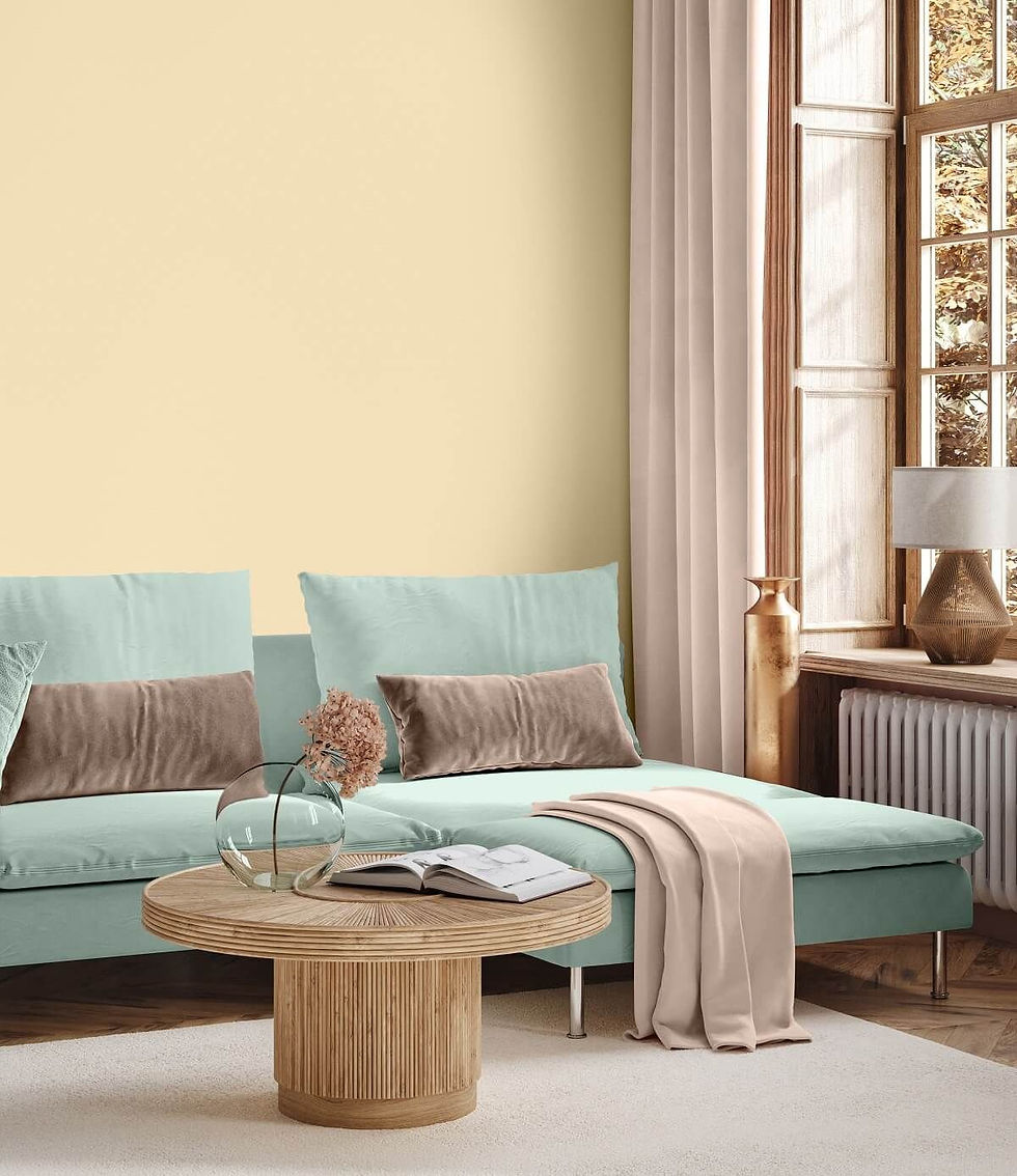
Limitless is a soft and warm yellow hue. It's versatile enough to be used on large surfaces, such as kitchen cabinets and walls, but can be used for accent and smaller areas like baseboards and ceilings as well. Since the hue is both light and warm, it can make spaces feel larger, brighter, and more welcoming. Like a ray of sunshine on your face!
VALSPAR
Renew Blue is an incredibly versatile and all-season shade that anyone can envision in their space. Inspired by elements like fog, mist, clouds, and glacier lakes. Renew Blue elevates the everyday mood, encourages self-expression, and evokes a feeling of balance and calm, with a twist of unique spontaneity. Shades of blue to blue green proved popular in homes for the past few years.

One of the services I provide is interior and exterior paint color selections. If I can be of service to you, please reach out!


Long-term durability remains a top priority for roofing specialists. They use proven materials that roofing fixer endure extreme weather and temperature fluctuations. This commitment ensures homeowners enjoy dependable protection and increased property value for years.
Educational workshops introduce clients to long-term strategies for maintaining healthy habits. These sessions explore practical skills like label reading, grocery shopping, and weight loss naples florida portion estimation, reinforcing independence and confidence in daily nutrition decisions.
Sintra holds many attractions, but one palace stands as its crown jewel and a true symbol of Portugal’s charm. Purchasing Pena Palace Tickets ensures access to this extraordinary landmark perched high above the town.